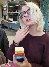
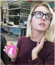
Element of Art Cube
This project was designed to teach us the elements of art. We did this through sketching out several different examples of each of the elements and turning our final drafts into a cube with each element on each side (as shown below).
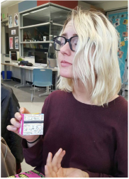
Color
Color consists of three things: hue (red, orange, etc.), value (the same color but darker or lighter) and intensity (neon vs pastel). There are also primary colors (yellow, red and blue) and secondary colors (orange, purple and green) that are made by mixing the primaries.
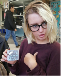
Form
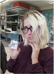
Form is when a 3 dimensional object shows depth. As shown above, I chose to express mine by showing the depth of a city scape with 3 dimensional buildings.
Texture
Texture is drawing something that displays how it might feel to the touch, even though the paper is smooth. An example is how the bark of a tree is rough but the paper smooth. The same goes for fish scales water ripples.
Line
Line is one point on a plane that expands for any amount of distance or is never ending (as the mathematical definition goes). Making a composition of line is difficult to do without connecting the points and accidentally turning it into a shape.
Space
Space is the area around any object. Space also refers to creating something 3 dimensional looking in art. There is both positive and negative space. The space around the objects is the negative space and the object itself is considered positive space.
Shape
Shapes can be as simple as circles and triangles or a 30 foot blob. All that matters is that it is a closed line. Other than that, anything applies.
Process
In this project, we went over mini lessons that would define and explain each element of art. We would then be shown examples and would set to work on sketching out our own examples of the element we had just learned about. We would conduct a first draft, then give it to someone around us to critique.
After the critique, we would work on a second draft of our element using the critiques given to us. We would then search the room for someone new who hasn't given us critique yet and ask to switch papers to give each other feedback. Using this, we would then make our third sketch and give ourselves pointers on what to do for the final draft.
Then, when we felt confident that our third sketch was neat and properly defined the specific element we were studying, we transferred it onto card stock paper for our final drafts. When we finished carefully drawing out our elements, we cut them out and folded them and glued them until they formed a cube.
Reflection
This project really taught me a lot about the elements of art. I can now distinguish elements of these in art pieces all around me as well as in every day life. I, myself, love art and drawing and it was very refreshing to go over these elements and I feel it really improved my work.
In terms of feedback, I finally learned how to give good, solid feedback. Chris taught us a sort of sandwich design to give our feedback. It goes like so: Specific complement, suggestive criticism, specific complement.
I used to always include the words "nice job" in my feedback and he pointed out that this is not at all helpful. It really improved the way I gave and received feedback. I have also learned to really utilize feedback of others when it is given well and how to sort between the helpful and pointless comments.
With revision, I used to believe that my first draft (at least in art) would be the best I could do because it was original and not over thought. With these constant revisions and heavy feedback, I have seen my art increase in quality right before my eyes and all the different styles that could become accessible through asking my peers around me how I could improve instead of just using my own opinion. It's like looking at my work through a new set of eyes and really helps to distinguish what could be done better.
